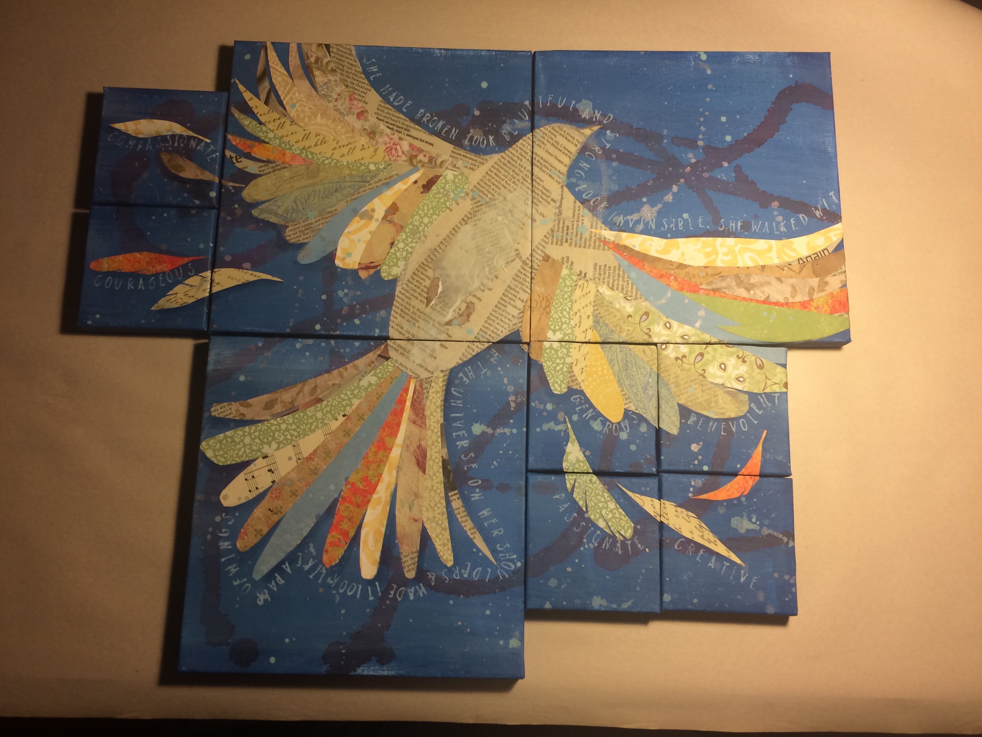
I was asked to create nine pieces for family to be distributed at an upcoming family reunion. The only direction given was that the pieces should somehow relate to each other, and each of the smaller panels should contain a specific word that described a strong trait of the recipient.
Here’s how it came together in six simplified steps:
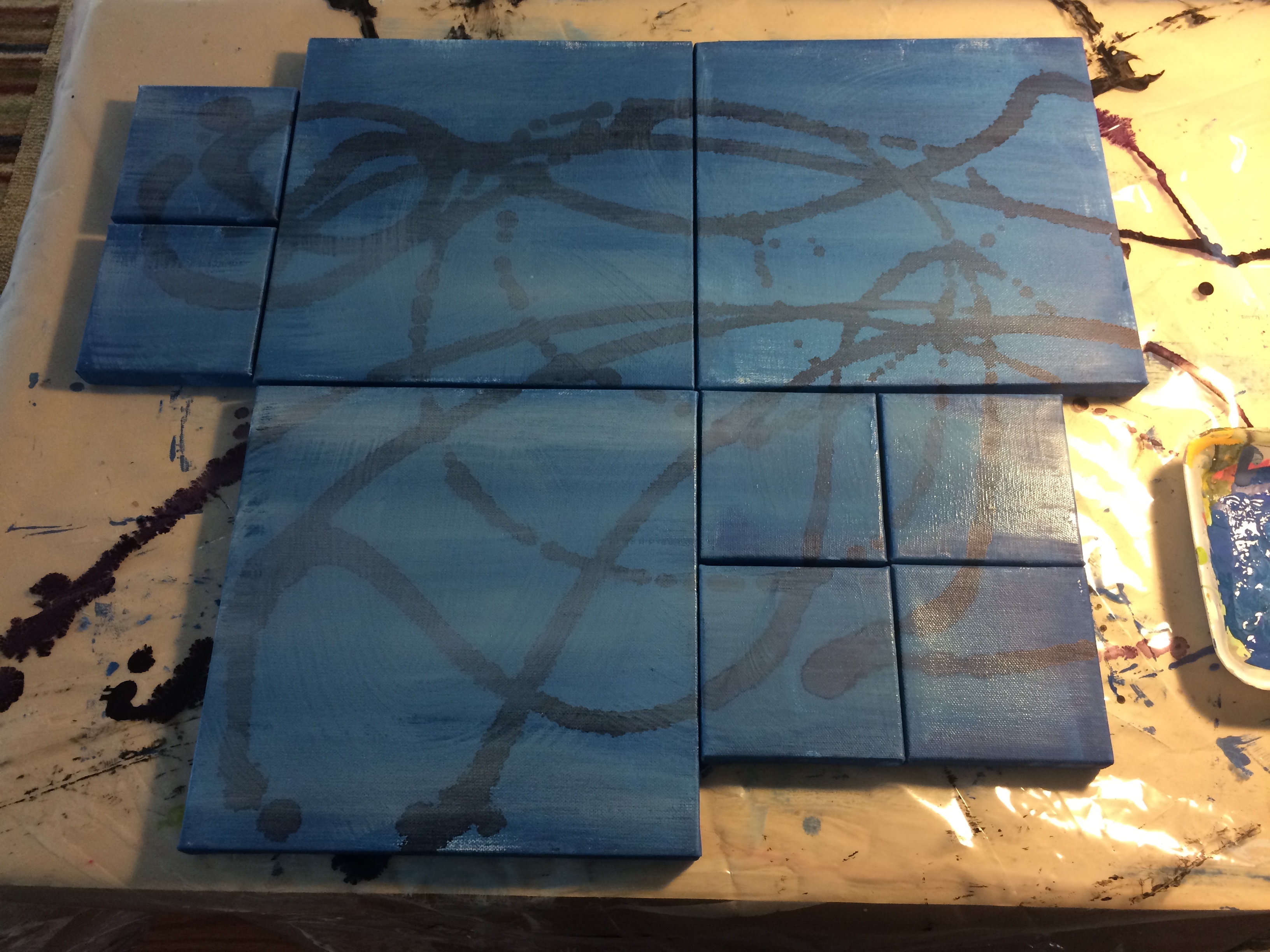 I started out knowing that I wanted the pieces to actually connect, to symbolize the family as a single unit made up of many different parts. The common background color and swirls of alcohol ink provide this visual foundation.
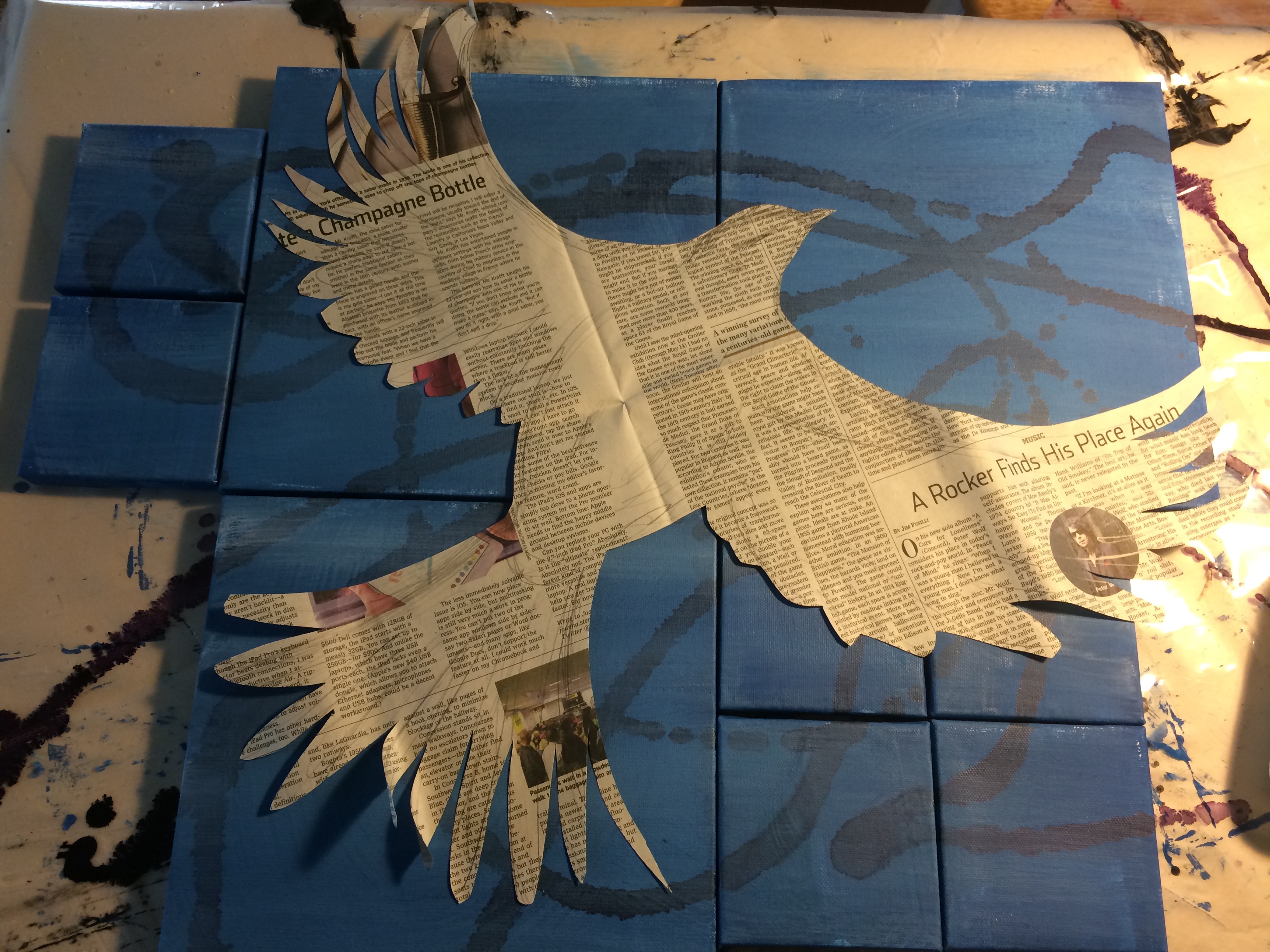
A bird in flight was a strong, personal symbol for this family, and for me as an artist.
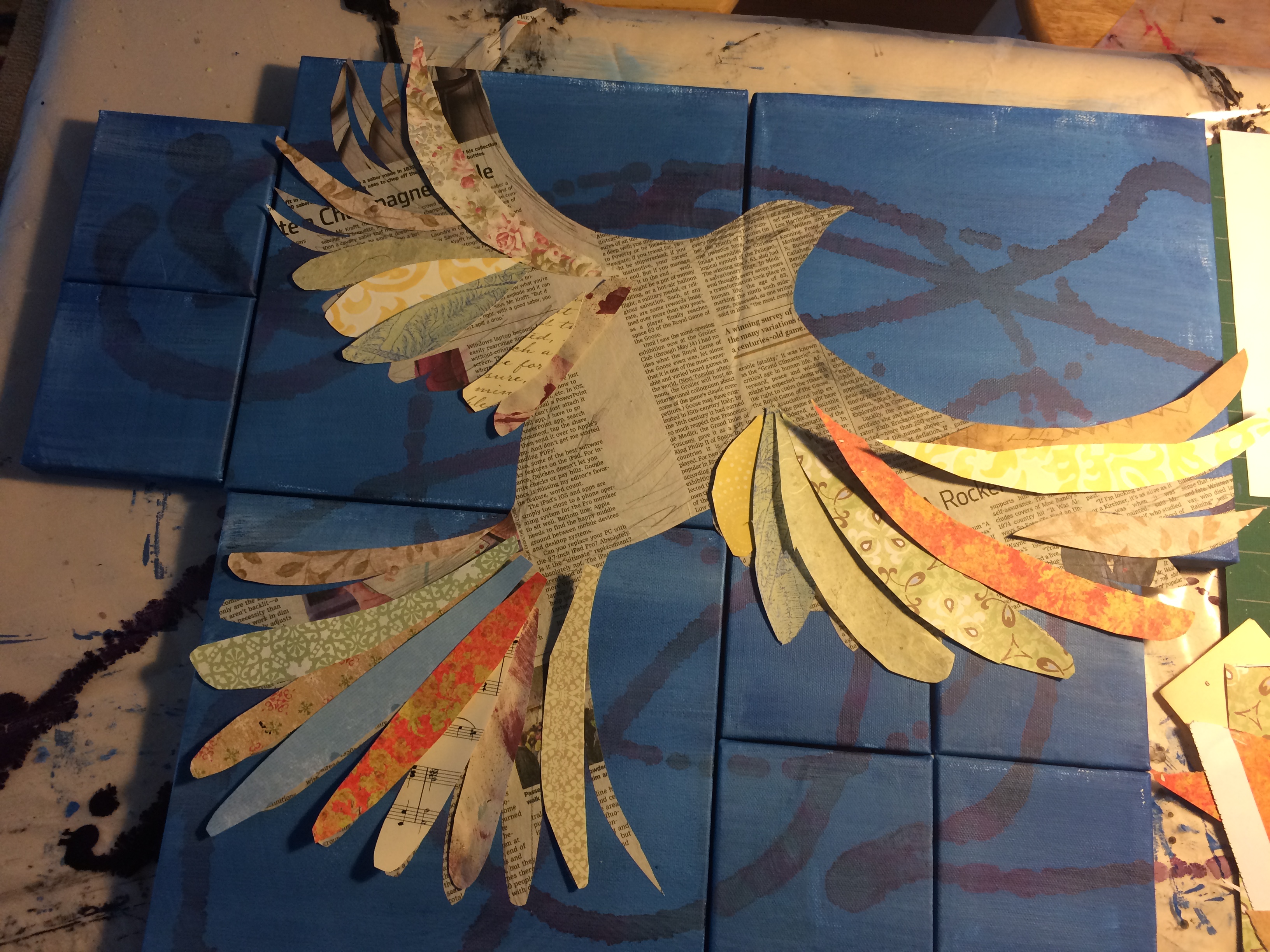
The multi-colored feathers also took on deep meaning as it added color and patterns that resembled a quilt, another strong symbol for this family.
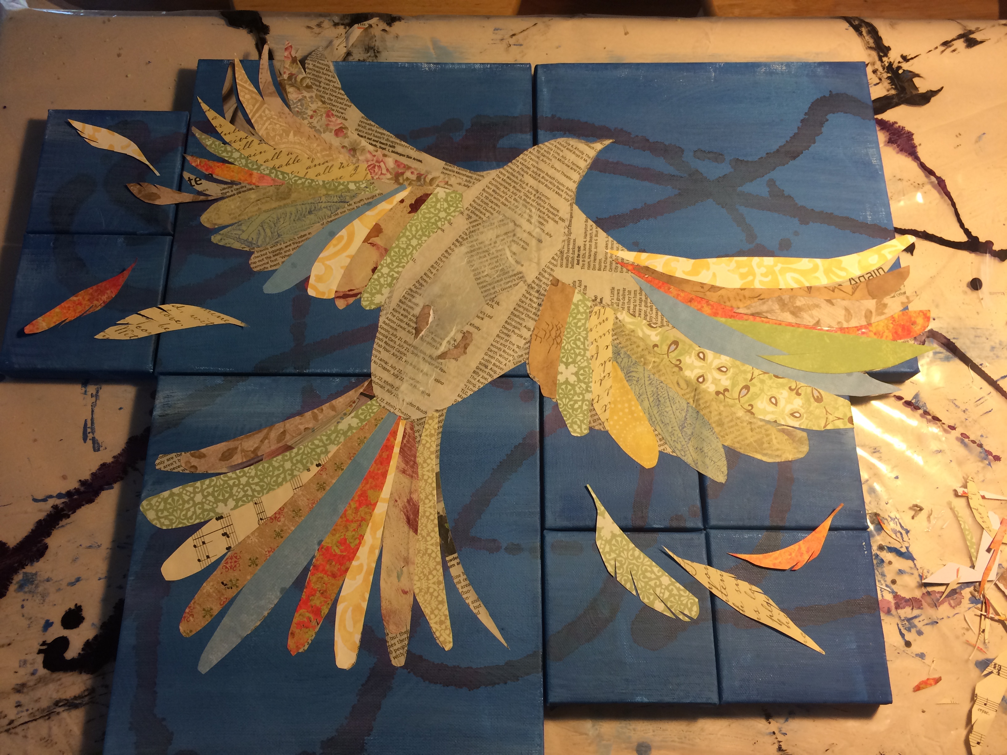
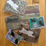
Feathers were added to the outside panels so that each recipient had a piece with visual interest and connection to the entire image. At this point, the panels are still physically connected by the graphic elements. Paint splatters are added for texture.
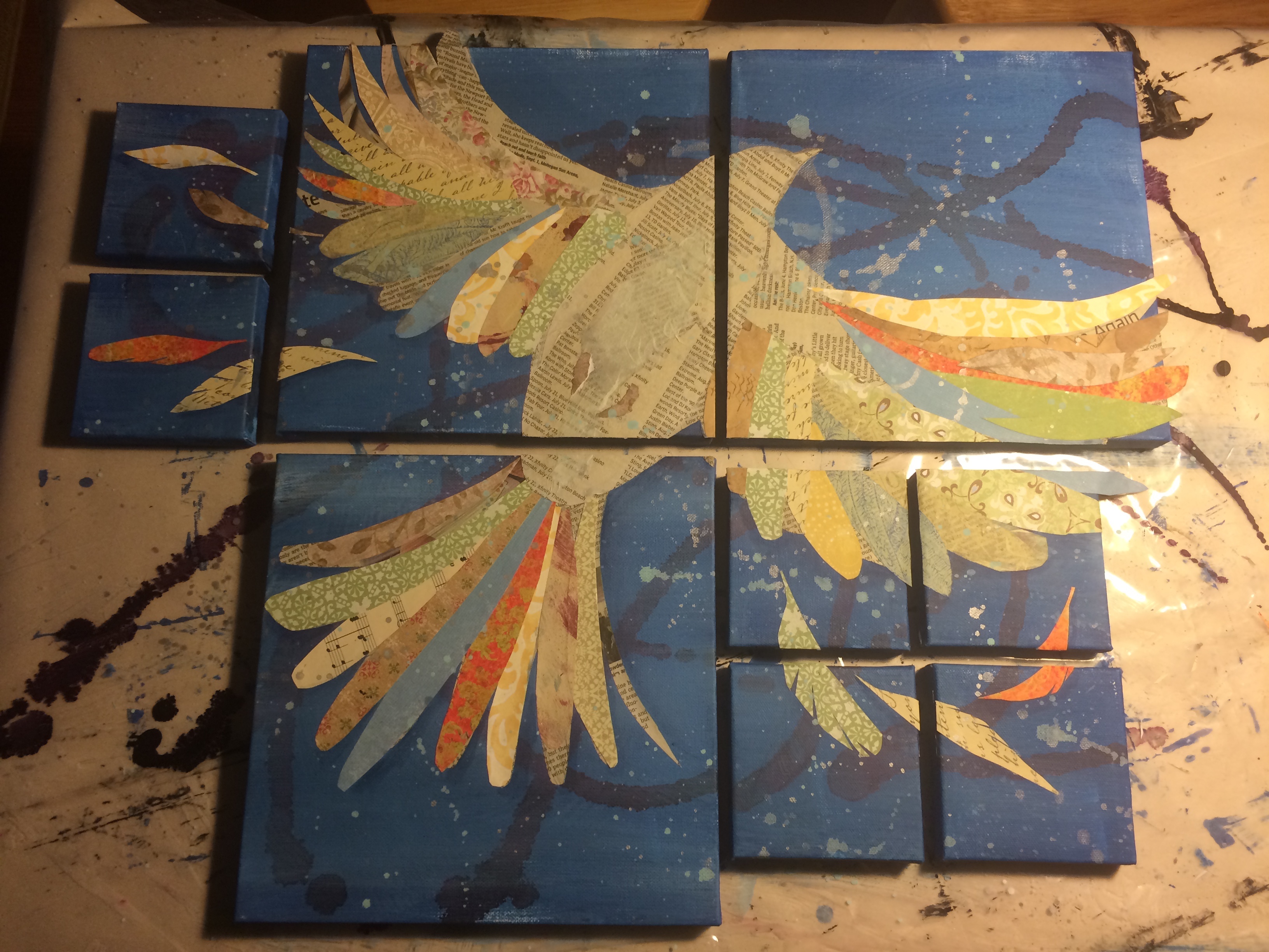
When dry, the pieces were carefully cut apart with an X-acto knife.
Edges were finished, words were added, hanging hardware applied. Finished!